a junior product designer specialising in digital ux & ui design solutions
< back
bruno’s best friend

what is bruno’s best friend?
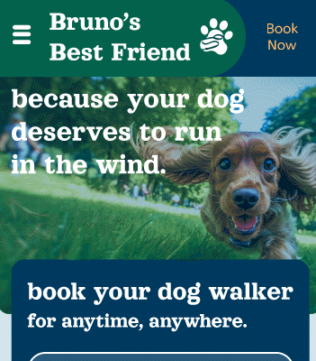
Bruno’s Best Friend is a dog walking business who needed a website that was able to connect their customers to their database of dog walkers.
As the sole designer on this project, the end goal was to create a high-fidelity prototype of the potential website. This prototype would be tested against the customer base to ensure that their pain points with using the pre-existing booking system would be soothed.
This functional prototype focuses on what a mobile version of the website could look like for a user, but high-fidelity designs of tablet and desktop designs were also created.
gaining an insight
To gain an insight into the areas in need of reconstruction, existing users of the platform were surveyed. It allowed for identification of pain points that these users have, and what needs are not being fulfilled with the current interface.
The common user of the Bruno’s Best Friend service were busy people. Either busy parents, or working professionals unable to engage in a work from home environment. They needed the help to ensure their pets were being well socialized and exercised while they juggled their 9-5. They needed payment and booking flexibility for their rigid lifestyles.
From these interviews, two primary user profiles were constructed. One of a busy parent, and the other of a working professional. These were then used throughout the design process as a point of reference.

the design process
All design starts with an idea, and there is no better way to generate ideas quickly than by creating a brainstorm. Once the initial ideas were laid out, the design components were refined with a mood board to provide the client with, and the UX was refined with a user interface flow chart.

Once the rough flowchart and design was conceptualised, it was combined together to create some low-fidelity wireframes.
These low- fidelity wireframes were then refined into mid-fidelity design mock-ups that allowed for review and basic user testing.

Through this process of creating the mid-fidelity designs, it was crucial that the typeface, colours and design remained accessible and that they complied with standard.
Subsequently, these elements were constantly iterated upon during the initial design phase.
synthesis and user testing
Once the mid-fidelity designs were created, they were turned into functioning prototypes.
These prototypes were then tested within the target demographic. How does the user interact with the site? Are they able to easily navigate to create a booking, and does the user flow make sense?
Over the course of 3 usability sessions, users were be provided with a copy of the mid-fidelity prototype of the Bruno’s Best Friend website. They were observed during the course of the session and were be asked to describe their actions and sights.
Observations were recorded, and when necessary users were further questioned to refine their insights.

implementing testing feedback
Usability testing highlighted many areas of refinement that were needed within the prototype. Our first step was to collate each comment and observation made, and group these into similar themes & issues. These 4 areas were navigation, search functionality, booking process & viewing the information in the walker profile.
There were some wins with this prototype including users being able to successfully navigate and create a booking, with it appearing that users were not stuck at any points.
For areas that needed improvement and refinement, brainstorming commenced to come up with proposed solutions.

before
after
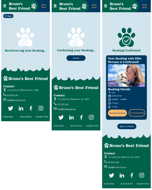
the final prototype
After adding in animations, refining the user flow by adding in transition screens, and removing unnecessary pathways, Bruno's Best friend mobile website was finalised.
Final, short tests of the website proved to be successful within the earlier tested demographic. Users were able to easily book a dogwalker on the fly and navigate with ease.
final thoughts
This prototype was a masterclass in Figma. Working with a new application was a challenge, but was navigated through own experimentation with Figma.
Learning to work within accessibility standards to ensure compliance was also something that was new to my design practice.
These valuable skills learnt will now continue to be apart of my design process.
In terms of the prototype itself. In future, the design could continue to be refined further. User testing of the product over a longer timeframe, ie: a week, could provide insight into areas which might need further refinement.
But overall, this high fidelity prototype proved to be successful.
connect with me
isabella6701@gmail.com
melbourne, australia
website design by me